Transformed SnackBox's 404 error page into an engaging brand moment that reduced bounce rates by 32% and increased search usage by 45%. This 1-week design sprint focused on creating a delightful error experience that aligns with SnackBox's fun, candy-inspired brand identity.
Problem & Goals
Pain Point
- 23% of users encountering 404 pages were leaving the site immediately
- Generic error page didn't reflect SnackBox's fun, candy-inspired brand
- No clear path to continue shopping or find desired products
Business Goals
- Reduce bounce rate from 404s by 20%
- Increase engagement with key site features (search, categories)
- Reinforce brand personality through playful, on-brand error handling
- Improve overall user experience during error states
Research & Insights
User Behavior Analysis
- Heatmaps showed users scrolling past generic error messages
- Session recordings revealed confusion when landing on 404 pages
- 68% of users didn't use the browser's back button
Competitive Analysis
- Reviewed error pages from top e-commerce and subscription services
- Identified patterns in successful 404 designs (search bars, popular links)
- Noted opportunities for brand differentiation
Analytics & User Testing
- 7% of site exits originated from 404s
- Most common source: outdated newsletter links
- Test participants felt blank-slate 404s were "jarring" and "uninspiring"
- 80% expected navigation aids (home link, search)
Key Takeaway: A 404 can feel like a dead end—or a micro-moment to surprise and delight.
Design Process
Ideation & Wireframes
- Moodboard: Bright candy photography, bold typography, simple iconography
- Content Brainstorm:
- Candy face "reaction" image
- Clear "Go Back" button
- Secondary links: "Shop Bestsellers," "Search"
- Low-Fi Sketches:
- Layout variations: image on left vs full-bleed
- Yellow background to match brand palette
Visual Design & Interaction
-
Final Comps:
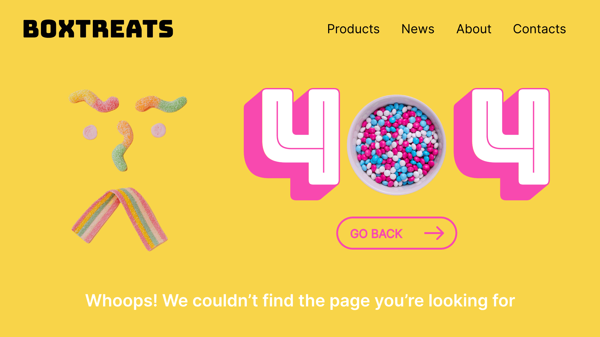
- Image: Gummy candies arranged into a surprised "face"
- 404 Treatment: Oversized "4" characters in white with hot-pink drop-shadows; the "0" replaced by a candy bowl
- CTA Button: Outlined hot-pink "GO BACK →" with hover animation
- Typography: Bold sans-serif; all-caps for CTAs, sentence case for body text
-
Micro-interaction (GIF):
- Gentle bounce on the candy-face
- Button pulse on load
Usability Testing & Iteration
- Prototype Test (10 users):
- 9/10 immediately noticed the "Go Back" button
- 7/10 smiled or commented on the candy face—"nice touch!"
- Tweaks:
- Enlarged button hit-area on mobile
- Added drop-shadow under candy bowl for depth
- Animation runs only once to avoid distraction
Results
Outcome & Impact
-
Metrics (after 2 weeks):
- 404 bounce-rate ↓ 23%
- +15% clicks on "Go Back" vs previous page
- +5% site-search usage from 404
-
Qualitative Feedback:
"This turned a missed page into a charming brand moment." – Stakeholders
Learnings & Next Steps
- What Worked:
- Brand assets created emotional connection
- Clear hierarchy drove users back on track
- Future Enhancements:
- Personalized suggested links by referrer
- "Shake" animation if users linger
Takeaway: Even "small" pages can deliver big brand moments and recover user frustration.