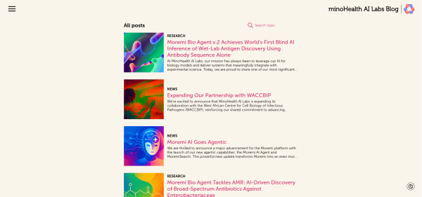
This is the content platform for minoHealth AI Labs, the same company as the Moremi AI product work. I designed it so a research post could sit between an academic paper and a blog — readable on a phone, without stripping the substance.
Business Constraint
Bridging the gap between academic paper and blog post. The content needed scientific rigor for peer review while remaining accessible to the general public.
- Scientific papers are dense, text-heavy, and intimidating
- Marketing blogs feel fluffy and lack substance
- A large share of the audience read on phones, often on uneven connections
Business goals:
- Establish authority — position Minohealth as a thought leader in African AI
- Improve readability — create a distraction-free environment for long-form content
- Scalability — design a system that grows with increasing publication output
Strategic Approach
1. The "Paper-Like" Aesthetic
Chose a warm, off-white background (FAF5EA) with dark gray text to mimic reading a physical journal — reducing eye strain for long-form technical reading.
- Headings: Bold sans-serif in the brand's primary magenta — adds energy without compromising readability
- Body: High x-height sans-serif (Inter) optimized for screen reading at various sizes
2. Distraction-Free Reading Layout
Single-column layout with no sidebar clutter, no trending posts, no ads in peripheral vision. Complex diagrams and code snippets get generous whitespace to breathe.
 Reading experience focused on clarity with ample whitespace and carefully selected typography.
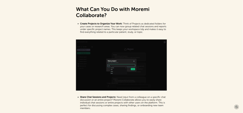 Complex technical features presented clearly within the blog content flow.
3. Clear Categorization System
Robust tagging system prominently displayed above article titles (RESEARCH, NEWS, COMPANY) — enabling visual scanning and immediate content-type identification.
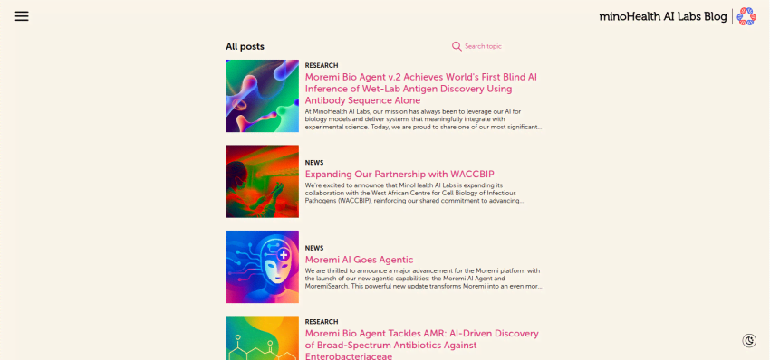 Blog index with vertical list layout, clear category tags and preview snippets for quick scanning.
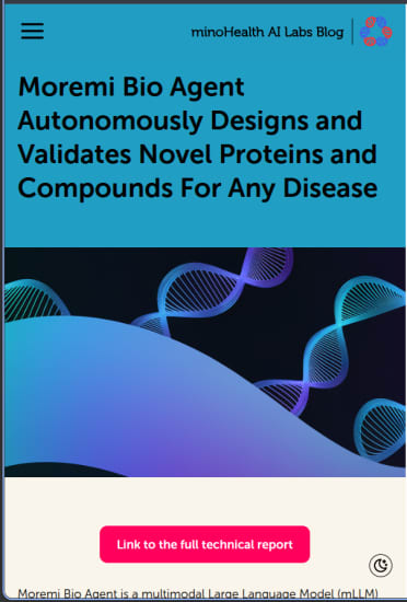 Mobile menu design ensuring easy category access on smaller screens.
4. Adaptive Light/Dark Modes
Seamless switching between viewing modes, ensuring reading comfort in any environment — critical for researchers working extended hours.
The blog is the public writing surface for minoHealth AI Labs — scientific enough for peers, readable for everyone else.
Related work: Moremi AI — the clinical product this blog sits beside. Varve — design-to-code on a different surface.